June Recap: Data Visualiztion
Data visualization is paramount to both understanding and presenting your data, whatever your data may be. For our June Meetup, R-Ladies Philly member Jake Riley led an interactive workshop to elucidate aspects of the popular ggplot2 package and share helpful tips and best practices relevant to any R user.
The 2 g’s in ggplot2 - defined!
Jake explained that the architecture of visualizing data using ggplot2 is based on the grammar of graphics: In ggplot2, just like every sentence has a subject, verb, and noun, every plot has a coordinate system, geom, and aesthetics.
mpg dataset:
library(tidyverse)

myplot <-
  ggplot(mpg) + #set the 'subject' or coordinate system
  geom_point(aes(x = cty, y = hwy)) #add the 'verb' or geom used to show the data, and 'nouns' or aesthetics on how the geom should appear
myplot
But what exactly does aes() control in plot aesthetics? Jake clarified this by explaining that dynamic, data driven variables go inside the aes(), while constant, static values go outside.
aes() arguments:
myplot.v2 <-
  ggplot(mpg) +
  geom_point(aes(x = cty, y = hwy, color = class)) +
  labs(title = "Setting color inside `aes()`")+
  theme(legend.position = "bottom")

myplot.v3 <-
  ggplot(mpg) +
  geom_point(aes(x = cty, y = hwy), color = "blue") +
  labs(title = "Setting color outside `aes()`")

gridExtra::grid.arrange(
  myplot.v2,
  myplot.v3,
  ncol = 2
)
Helpful tips, and best practices for plotting
Jake shared some tips for plotting, including:
- ordering barplots in descending (or ascending) order
- using
facet_grid()andfacet_wrap()
- controlling color and size more precisely using
scale_*_identity()
To make your plot as visually appealing as possible, Jake additionally recommended:
- approximating the golden ratio (1:1.6) for plot dimensions
- using color to highlight the most important plot features
- choosing a color palette amenable to colorblindness
Extensions and Addins
As a final activity, we explored ggplot extensions and ggplot addins and shared examples of our findings with the group
Alice shared how she added pikachu to her plot using cowplot 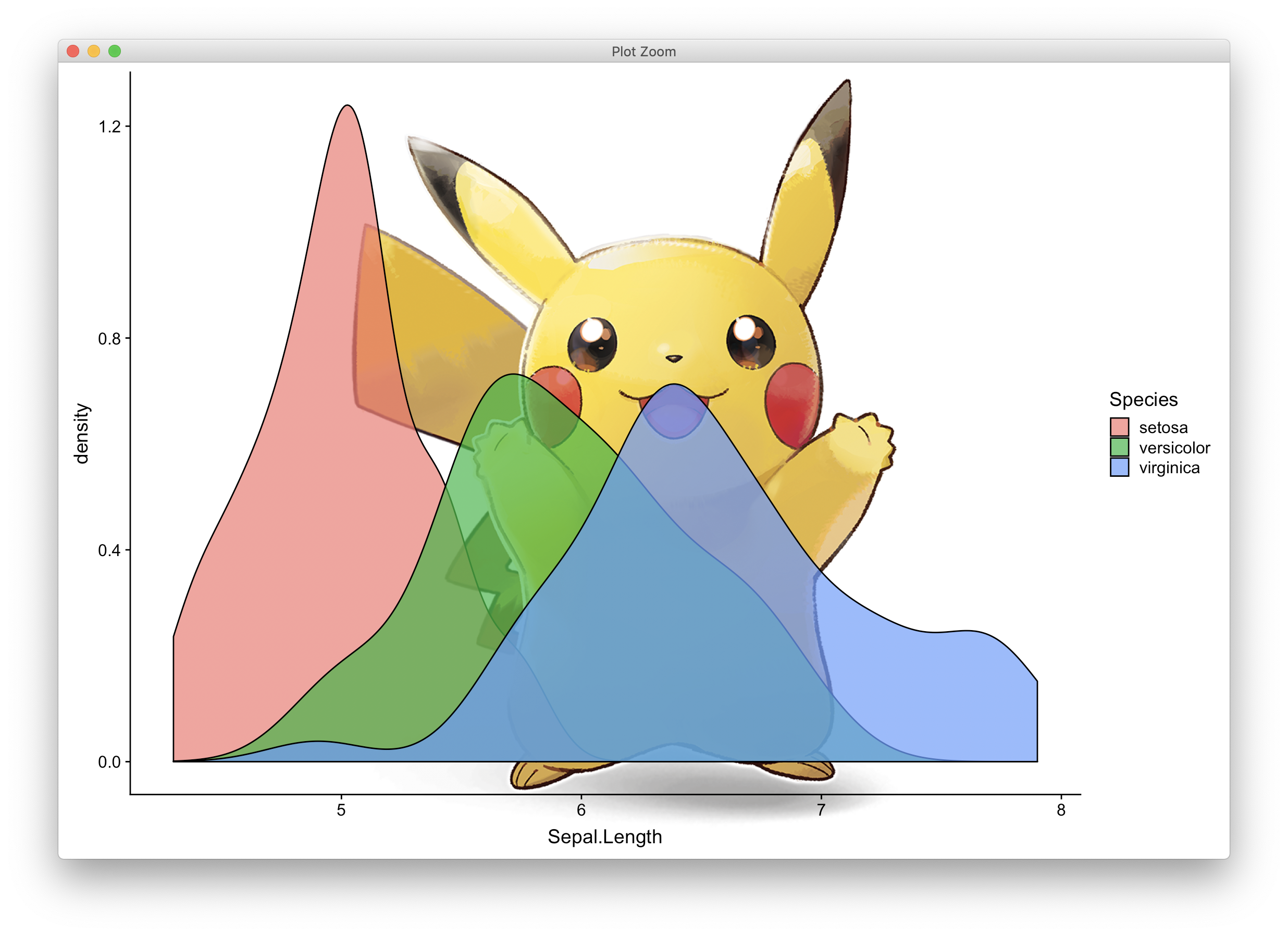
Check it Out
The slides and code from Jake’s workshop are available on his github!
WeWork
We would like to thank WeWork for hosting us!
“WeWork is a community for creators. We transform buildings into beautiful, collaborative workspaces and provide the infrastructure, services, events and technology so our members can focus on doing what they love. WeWork currently has 111 locations in 29 cities across the world with over 70,000 members. Book a tour at wework.com now!”
This post was authored by Katerina Placek For more information contact philly@rladies.org